Christian Care Communities & Services (CCC&S) offers multiple living options for seniors within the Dallas / Fort Worth area and Allen, TX.
Due to multiple residence and care locations, information was scattered across several sites and sections, often leading users to areas with no way back and no easy way to compare information between locations.
Within each location, some information (hospice care, for example), existed within its own microsite, thus further complicating the user journey and marring the user’s ability to compare information from other locations or further explore the location within which they were currently exploring.
These issues created friction for users attempting to efficiently locate relevant information and understand available offerings.
Additional difficulty arose from some users showcasing less technical prowess when it came to navigating complex sites, as well as some accessibility issues due to eyesight restrictions.
I was hired as a freelancer by a local marketing firm to assist with this project.
the challenge
Christian Care Communities & Services (CCC&S) offers multiple living options for seniors within the Dallas / Fort Worth area and Allen, TX.
Due to multiple residence and care locations, information was scattered across several sites and sections, often leading users to areas with no way back and no easy way to compare information between locations.
Within each location, some information (hospice care, for example), existed within its own microsite, thus further complicating the user journey and marring the user’s ability to compare information from other locations or further explore the location within which they were currently exploring.
Christian Care Communities & Services (CCC&S) offers multiple living options for seniors within the Dallas / Fort Worth area and Allen, TX.
Due to multiple residence and care locations, information was scattered across several sites and sections, often leading users to areas with no way back and no easy way to compare information between locations. Within each location, some information (hospice care, for example), existed within its own microsite, thus further complicating the user journey and marring the user’s ability to compare information from other locations or further explore the location within which they were currently exploring.
These issues created friction for users attempting to efficiently locate relevant information and understand available offerings.
Additional difficulty arose from some users showcasing less technical prowess when it came to navigating complex sites, as well as some accessibility issues due to eyesight restrictions.
I was hired as a freelancer by a local marketing firm to assist with this project.
the discovery process
Interviews & User Information
I began by conducting interviews with representatives of CCC&S to gain a better understanding of their points of contention with the current website. Due to privacy laws and concerns, I was unable to interview residents and their families. However, I was able to build some general user profiles based on feedback staff had received from residents and their families concerning their site experience, as well as general information on the average age and needs of residents for the different facilities and types of care.
Challenges Feedback:
Site Navigation – Some Residents struggled with site navigation due to less experience with internet usage
Site Complexity – Some residents, but mainly family members of residents, found the site overly complicated and struggled to find information they needed
Readability – Some residents expressed the text on the site was difficult to see in some areas
Website Audit & Findings
I then conducted a full site audit to determine any functionality issues and develop a deeper understanding of the site, site content, and information structure.
I discovered the largest problems with the site itself were as follows:
Inconsistent information – Information for each location was inconsistent, meaning some locations were missing information on certain programs, or information was structured in such a way that it made searching and comparing comparable information difficult if not impossible.
Inconsistent navigation – Each location, and some programs within those locations, had a separate micro-site, thus causing a confusing navigational structure and making navigating between locations and programs difficult.
Poor Mobile Experience – The mobile version of the site showcased numerous display problems, including a semi-functional mobile navigation often showcasing bugs, and charts and tables of information becoming unreadable on mobile display.
Poor Readability – Font size was inconsistent across locations and offered low readability for users struggling with vision problems.
the solution
Information Architecture (IA) Restructure
The very first thing I did was focus on a complete restructuring of the site’s information architecture from top level down to page structure, concentrating on the simplification of the user journey and consolidation of information for ease of comparison and consistent layout to help users know what type of information to expect.
This also allowed users to move between locations or access information about any service, along with where that service was located, easily at any point if they so desired. This made it possible to begin searching either by service or location first, a task that would not have been possible with the prior, heavily segmented model.
I was able to consolidate down from over 100 pages to only 31.
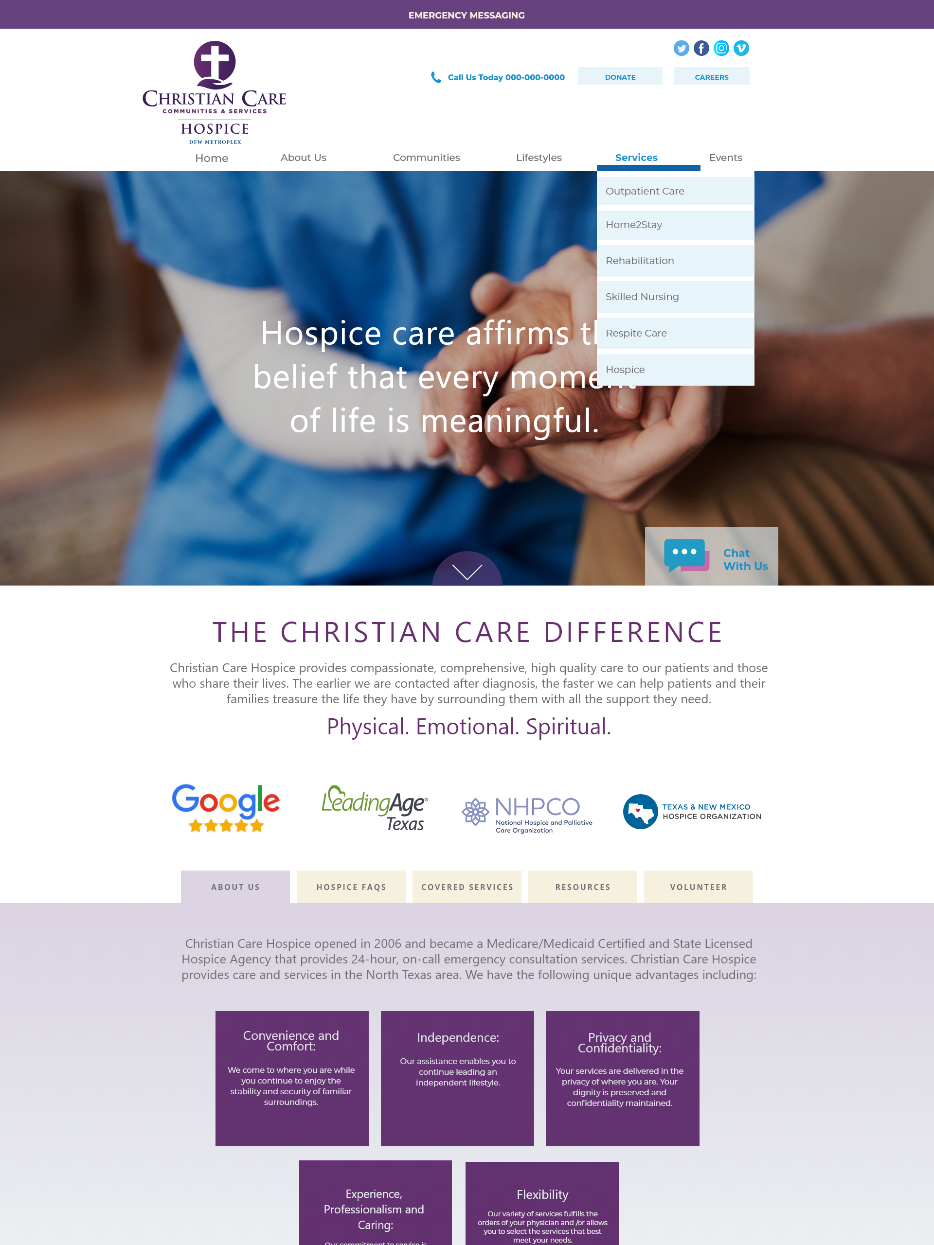
After restructuring and consolidating the IA, I developed a desktop tab system that reduced information complexity, allowing users to easily sort through details about a given location and / or its services while remaining on the same page.
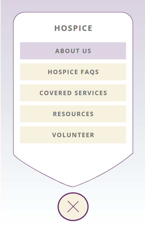
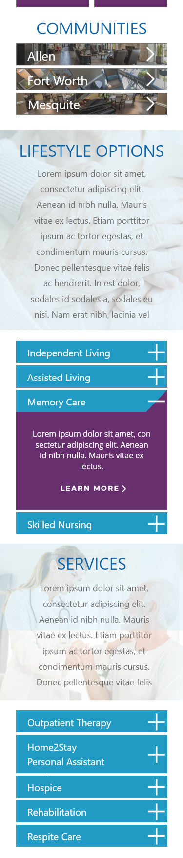
Mobile Tab System
I designed the mobile version of the tab system to allow users to select the information they want using the simplest interface to allow for a wide range of proficiency. The icon appears on the bottom of all pages with tabbed content and follows the user as they scroll. The “Plus” icon swivels to an “X” once selected, allowing users to close it out if they change their mind on making a selection.
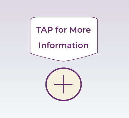
Mobile Tab Prompt
To make onboarding simple for all users, I designed a notification that will appear above the mobile tab “Plus” icon upon a user’s first visit to a tabbed page to alert them to its functionality and purpose. If ignored, the prompt will vanish in 10 seconds.
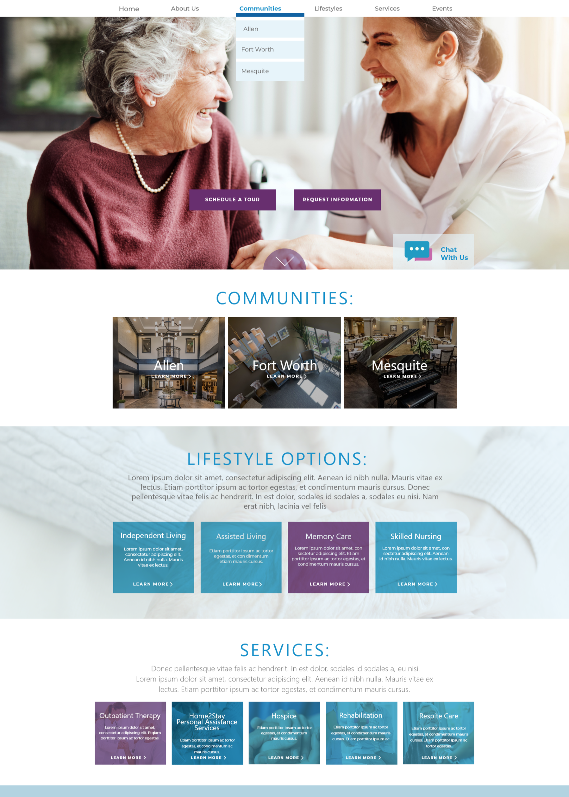
Box Accordion to Reduce Scrolling Length
As I was tasked with developing the mobile design, I reduced scrolling length by turning the information boxes utilized in the desktop design by our lead designer into simple accordion sections, rather than stacking the boxes. I also made the homepage location links shorter with an arrow designating it will lead users to a new page.
Communities Home - Desktop
Communities Home - Mobile
Communities Home - Desktop
Communities Home - Mobile
Communities Home - Mobile
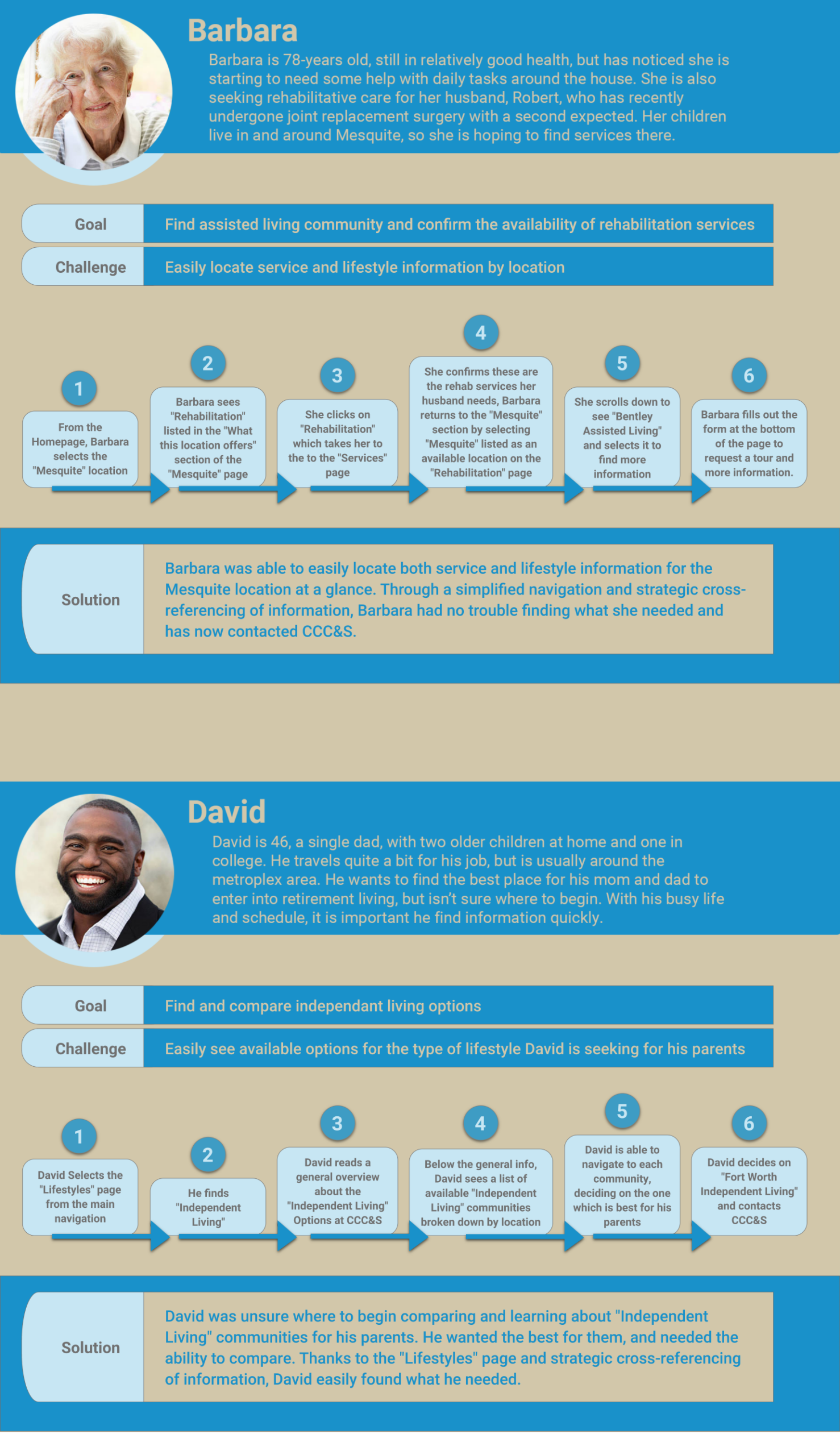
Final User Journeys
I created two final user profiles and journeys showcasing how the new IA, navigation, and page structure would better meet the needs of community members and their families.
needs & goals met
Simplified Navigation
Users can now begin their search from anywhere, including by location or type of care.
The simple tab system on high-information sections allows users to access details about locations and / or services quickly without having to move through multiple pages.
Information is now organized in a similar fashion within each section, thus giving users the ability to look for the information they need by knowing what to expect.
Improved Mobile Experience
Mobile tab system offers users a very quick and simple onboarding to be able to navigate through page tabs on mobile that meets the needs of users with low technical proficiency.
Creating smaller navigation boxes and turning information boxes into accordion-style widgets on mobile reduces scroll length.
Increased Readability
Increased font size and maintianing the same font for body copy throughout improved readability.