flave app

the challenge
Flave is an app designed to incentivize the hungry masses to forgo food delivery, at least every once in a while, and enjoy local cuisine in person. This is accomplished by allowing the user to earn “Flave Cash” through dining in at local, non-chain restaurants. This app-specific currency can then be exchanged for menu items participating restaurants choose to offer.
My team and I were shown, by representatives of the small start-up, only the front-facing end of the application with which patrons will interact. However, I recognized during our introduction how important it was to make certain restaurant owners and managers saw value in integrating the app into their daily flow, along with potential roadblocks.
NOTE: This project example focuses mainly on the creation of the Flave menu, navigation, and campaign creation ideation and prototyping. However, it does mention other contributions I made to the project including the creation of the Flave Feed and map. My team and I also worked on an “Analytics” section which is also mentioned below. The prototypes for those sections, however, were not created by me and are, therefore, not featured here.
NOTE: This project example focuses mainly on the creation of the Flave menu, navigation, and campaign creation ideation and prototyping. However, it does mention other contributions I made to the project including the creation of the Flave Feed and map. My team and I also worked on an “Analytics” section which is also mentioned below. The prototypes for those sections, however, were not created by me and are, therefore, not featured here.
the discovery process
We began by identifying needs and challenges specific to non-chain or smaller restaurants. We also wanted to discover what Flave could offer as incentives even if the restaurant was required to pay a small fee for access, thus benefitting both the restaurants and Flave.
Interviews
Members of my team conducted interviews with restaurant owners and managers in-person or via email. I personally interviewed people who had owned a small restaurant or food truck, or worked in the food industry as management for more than five years and had experience using apps (specifically delivery apps as these were the most common) as a part of their daily workflow.
Challenges Feedback:
App must be simple to use
Smaller restaurants often share a single tablet to process interactions
Employees may have widely disparate experience with applications / technology
Frequent turnover can complicate onboarding
Information about customers would be a good kickback for restaurants, even if restaurants had to pay a monthly fee
The restaurant needs to either have a guarantee that a certain amount of money will be spent in their particular establishment, or have a way to measure spending from Flave users.
competitor research
My team and I looked at the business models used by comparable competitors to Flave. I examined Open Table and, based on their reservation model, suggested we give restaurants the ability to drive traffic during times they might be slow. To do this, I recommended we give restaurants the ability to quickly and easily construct ads that can be pushed to the Flave Feed users already see at times the restaurants specify.
Goals based on competitor research:
- Ad campaigns may drive traffic to the restaurant during slower times
- Create a means for restaurants to quickly create ads that can be pushed out to socials
- Create a “Flave Feed” and a map that can be used by all Flave Users to see when local restaurants are running new campaigns
the solution
paper prototype
My team agreed to the inclusion of ad campaigns to drive traffic on specified dates and at specific times. To get us started, I conceptualized, built, filmed, and edited a paper prototype showcasing simple swiping interactions. This would make creating ads on the go quick and easily learned even by those with little experience using ad-building software.
I suggested and included in my prototype four different types of ad campaigns during which patrons can earn and exchange Flave Cash while attending.
The four campaign types are as follows:
- Happy Hour
- Events
- Flash Sale
- New Item
This prototype showcases:
- The ability to swipe left or right to view templates at actual size, or select from a menu to view all ads in a certain category
- The full ad creation process
- The publication process which includes, as I imagined, the ability to view and publish ads to the Flave Feed as well as social media feeds
changes & additions to original paper prototype
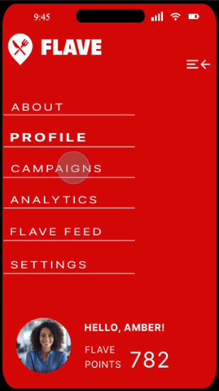
Main Navigation
I decided to keep the main navigation as simple and unambiguous as possible, landing on a left-hand slide-out navigation with clearly labeled buttons activated by a top hamburger either by click or drag (this prototype shows dragging action). This mimics Google Drive’s simple mobile menu style and makes onboarding simpler.
Breadcrumbs
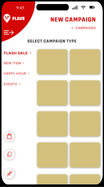
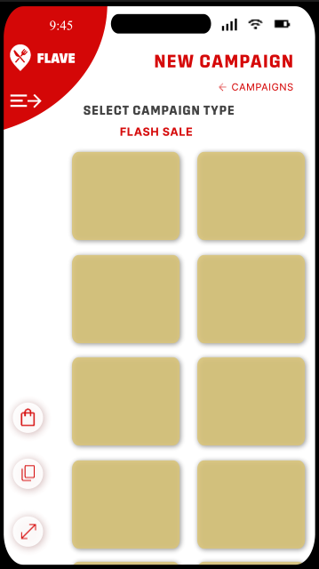
Since this was still an undeveloped app, we decided one of the goals was to limit section depth to further simplify navigation. With a paired down IA designed to limit sections to only a short depth of two or three pages, I also suggested that any section-specific navigation should appear at the top under the header to bring immediate attention to it and prevent the user from being confused by the change in the section header itself.
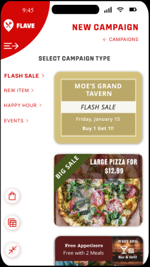
As one can see here, the user selected “New Campaign” using the plus icon and is now on the “New Campaign” section under which they can select a campaign to build. The simple breadcrumb below the section header indicates they can return to the “Campaigns” homepage by clicking it.
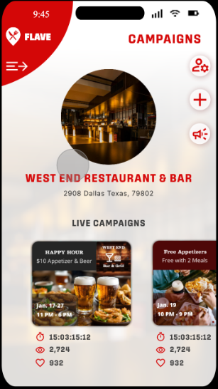
Page Specific Navigation
Outside of breadcrumbs, I designed the remainder of the navigation to be conducted within the section itself using small, out of the way icons and buttons.
- The “Person & Cog” icon – leads the user to section-specific settings. This appears on the top page of all section home pages excluding only “About” and “Settings”. The User can also go to the “Settings” section of the app to locate which settings they would like to change for which section or profile.
- The “Megaphone” icon- Takes them to detailed info on their currently running campaigns.
- The “Live Campaigns” section – allows for a quick status overview.
The user can also go to the “Analytics” section of the app to look at both live and historical campaign data.
Added Actions to New Campaign Section
As a part of the incentive for restaurants to use the Flave app frequently, my team and I decided to allow restaurant account owners to earn “Flave Points” accumulated through use of the app over time to purchase new campaign templates.
The “Shopping Bag” icon leads user to where they can purchase those new templates.
The “Expand” & “Minimize” icons allow the user to collapse the campaign type menu and expand the view area for the campaign templates. This also slightly raises the “Select Campaign Type” copy and places the campaign type currently selected beneath it.

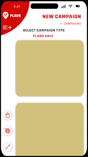
The final icon, the “Two by Two” and “Single Stack” icons allow the user to toggle between larger images of the campaign templates, or slightly smaller ones stacked side by side, allowing them to see more at once. In both cases, the templates scroll up and down.
Date Picker & Font Selector
Our final mockup remained fairly close to the process outlined in the paper prototype, taking some additional inspiration from apps like Canva. This meant simplifying the editing process and moving it from a pop-out design to below the editable area.
We chose the dimensions of campaigns based on the average, recommended image size for social media.
I decided to create a date picker, as opposed to the calendar shown in the paper prototype to make selecting more date selection simpler and more efficient.
The date picker works like native, modern date pickers, scrolling up and down to select a date. The top date appears in the “Date” area of the template.
Instead of using icons to denote editable text areas, I decided users can simply tap any area of text to type, and change font type and weight.
Typing within areas other than the date area utilizes the phone’s native keyboard. Hitting “Enter” closes the keyboard and automatically opens the “Text” options, allowing users to either go ahead and hit “Done” to exit or select from font type and weight.
We decided not to offer font size and color to limit problems with readability. Though, being able to change some of the template colors and fonts along with that, to a limited degree, could be a later addition.
We wanted to keep the options light for the sake of efficiency as being able to build campaigns quickly will be an asset to restaurants when already pressed for time. Offering a large range of templates in exchange for Flave Points offers more expansive options while maintaining a simple design.
needs & goals met
Incentivizing restaurant participation through added value:
Patron analytics and information when Flave users check-in and exchange Flave cash at a given location
Campaign analytics
- Restaurants can push surveys out to Flave patrons to collect helpful feedback
Simplified Onboarding:
- Unambiguous menus
- Fast and simple campaign creation
- Effortless swiping and clicking actions
Accommodating restaurants with only one device for use:
App can be accessed by phone
Account owner (restaurant manager, owner, etc.) can set user roles, limiting access to some users. (Ex. A specified user can build ads, but not access analytics)
NOTE: “User Roles” appears on the bottom of the “Settings” page for the main account owner and those given permission to edit permissions by the account owner. Though the concept was introduced by me, the “Settings” page was designed by a team member and, for this demo, was outside our scope of interaction development.
Monetization opportunities – restaurants pay a monthly or yearly subscription for Flave which offers:
Patron and campaign analytics
- Patron surveys
- Flave Feed & Map to incentivise business via campaigns, especially during normally slow times
